AI versus corporate logos
I recently started playing with DALL-E 2, which will attempt to generate an image to go with whatever text prompt you give it. Like its predecessor DALL-E, it uses CLIP, which OpenAI trained on a huge collection of internet images and nearby text. I've experimented with a few methods based on CLIP, but DALL-E generates particularly clear, coherent images.
So of course I decided to use it to mess up corporate logos.
![AI-generated signs on buildings or on food. They're all black and yellow with all-caps letters reading variations on "Wabflfe Fofle" and "Hafe Wouse" and "Waffle Woffee"](https://www.aiweirdness.com/content/images/2022/06/Waffle-house.jpeg)
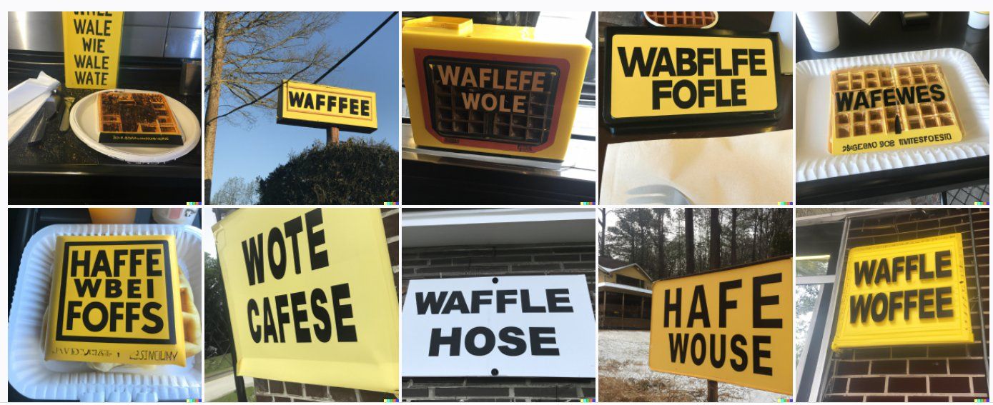
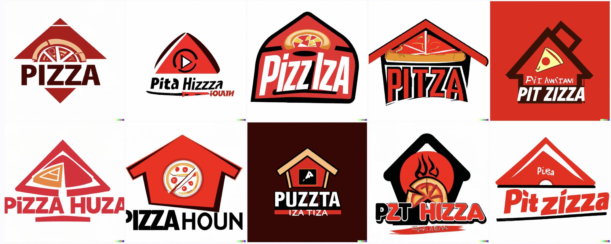
Literally all I had to do was ask DALL-E to generate "The local Waffle House". (as opposed to the local haunted waffle house, which is also a thing I've used AI to generate) Or, below, "The Pizza Hut logo".
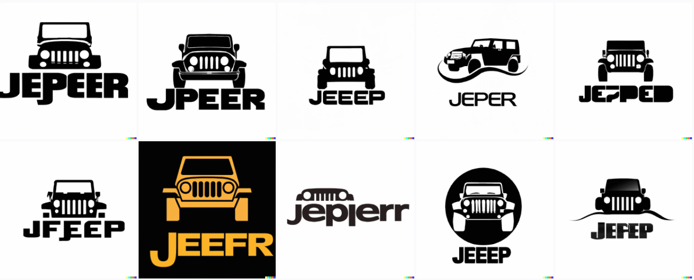
![Various logos in black and red, some with small pizzas or wedges of pizza on them. They read variations on "pizza huza" and "Pitza" and "Pit zizza"](https://www.aiweirdness.com/content/images/2022/06/Pizza-hut.jpeg)
Or the Jeep logo.
![Black and white logos with jeep silhouettes on them (or in one case just the headlights and front grille). The text reads Jeeep, and Jepep, and jepjerr, and Jeefr.](https://www.aiweirdness.com/content/images/2022/06/image-4.png)
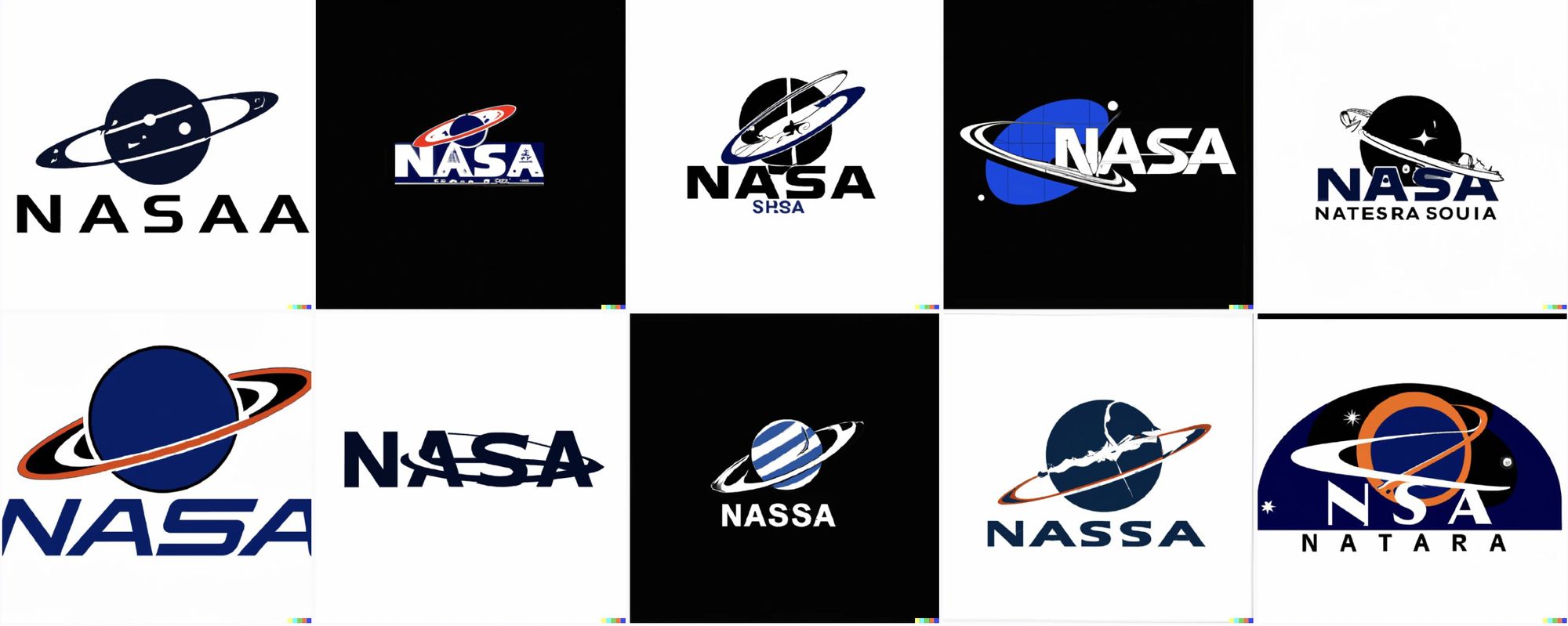
It gets some of these correct enough that it MUST have gotten them from information online. Like, it knew that the NASA logo involves an orb with a partial ring. But it has transformed that into a full-on Saturn which, admittedly, is pretty cool-looking.
![Black, red, and blue logos, featuring saturn and its rings. Text reads "nasaa" or "nassa" or even "nsa natara" and half of them read "nasa"](https://www.aiweirdness.com/content/images/2022/06/nasa.jpeg)
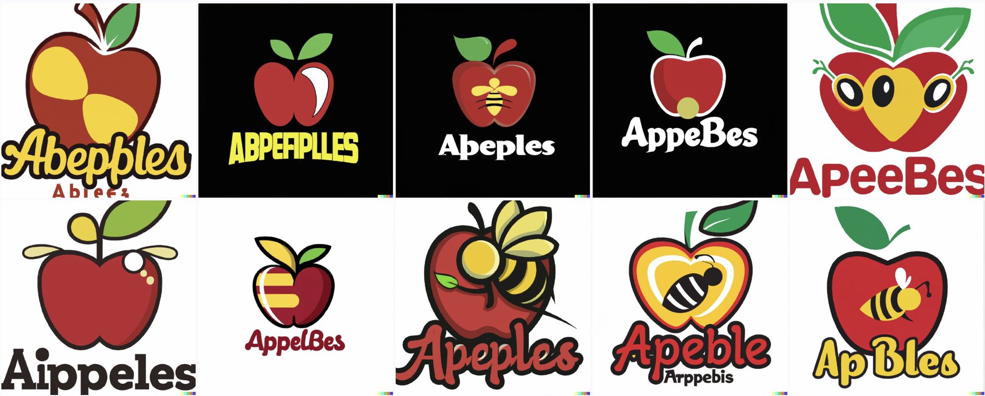
Or in the case of Applebees it seems to have decided that the logo would be better if it contained actual bees.
![Red apple logos, some with bumblebees on them. Text reads "Aippeles" or "Abperiplles" or "Abepples" or "Apeebes"](https://www.aiweirdness.com/content/images/2022/06/applebees.jpeg)
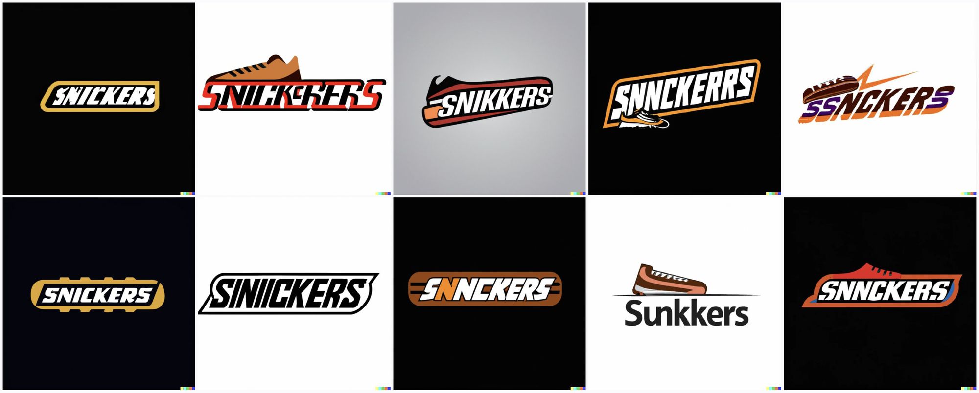
It seems to have picked up on the general shape of the Snickers logo. But apparently decided sometimes to add sneakers as well.
![The logos on average look a bit like the Snickers logo, but several of them incorporate small sneakers, and they all say things like "Snnckerrs" and "Siniickers" and "Sunkkers"](https://www.aiweirdness.com/content/images/2022/06/snickers.jpeg)
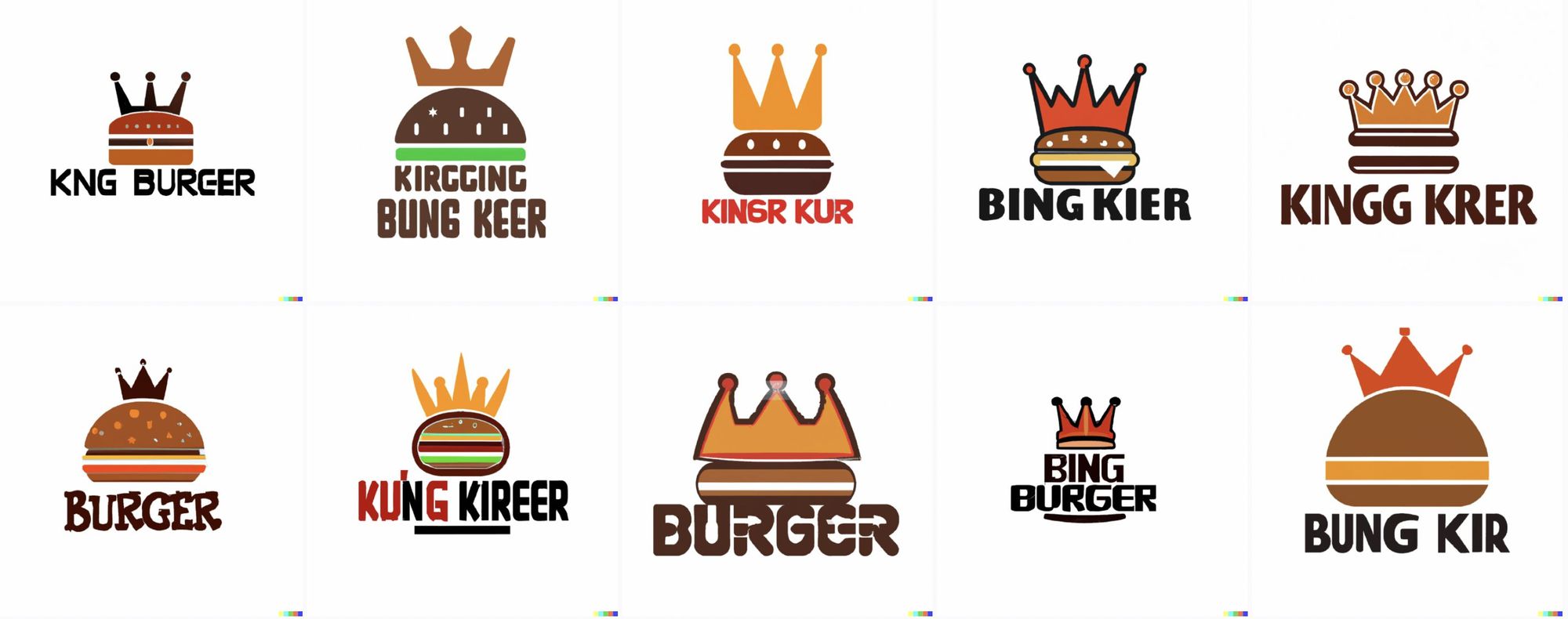
And it's clear that the Burger King logo definitely needs a crown on the burger.
![Logos that are burgers with crowns on them. The text reads variations on "Kirgging bung keer" and "bing burger" and "BURGER" and "Bung Kir"](https://www.aiweirdness.com/content/images/2022/06/Burger-king.jpeg)
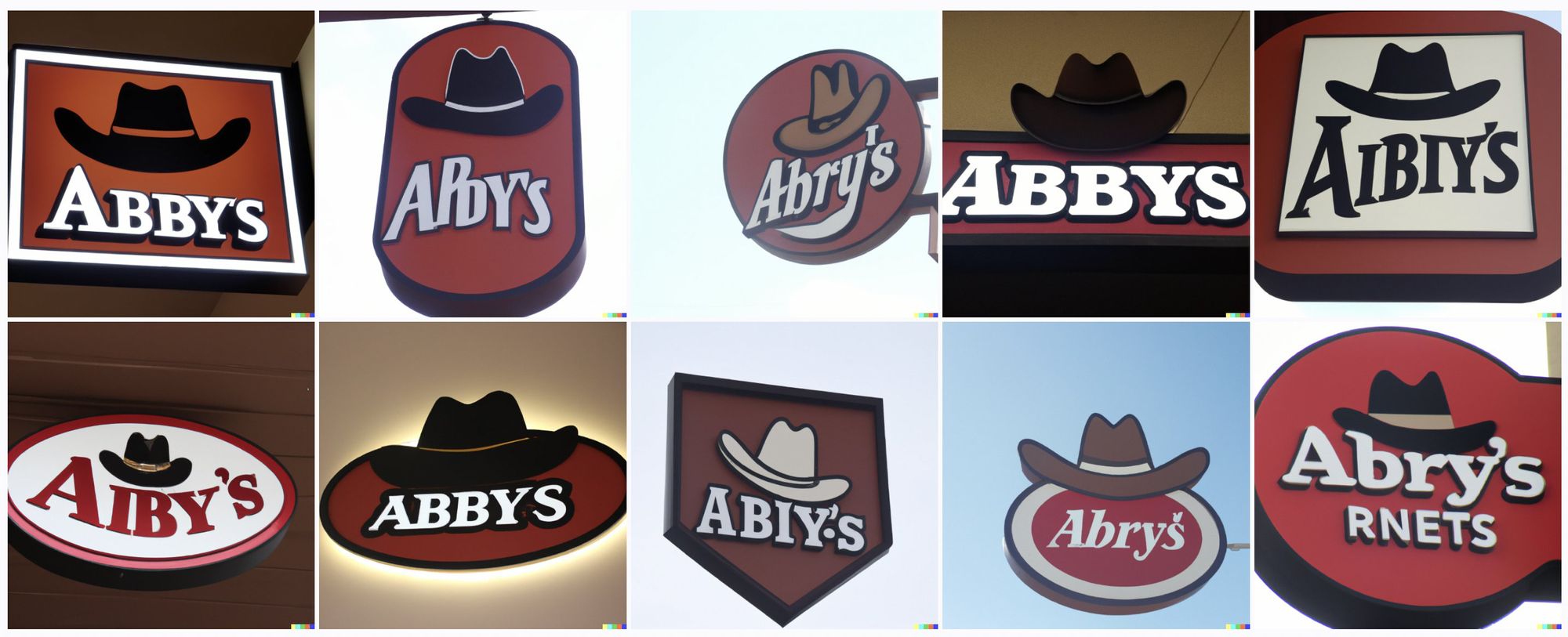
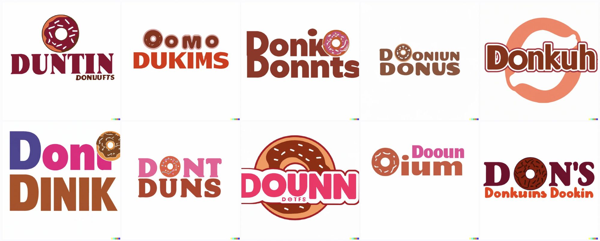
I'd be lying if I said the spelling wasn't hilarious. The spelling is pretty hilarious.
![Logos that are dark red, black and white, like the real dr pepper logo. All have bottles or cans incoroporated into the logos, which are spelled like "Derpper" and "Depper" and "Pepeper"](https://www.aiweirdness.com/content/images/2022/06/dr-pepper.jpeg)
![Store signs mostly in purple and yellow. Many of them are triangular and/or include cartoon bells. One has a real bell, ludicrously tiny. They read things like "Belco Tab" and "Teico Ball" and "Belo Becao" and "Tel B. Baclo"](https://www.aiweirdness.com/content/images/2022/06/taco-bell.jpeg)
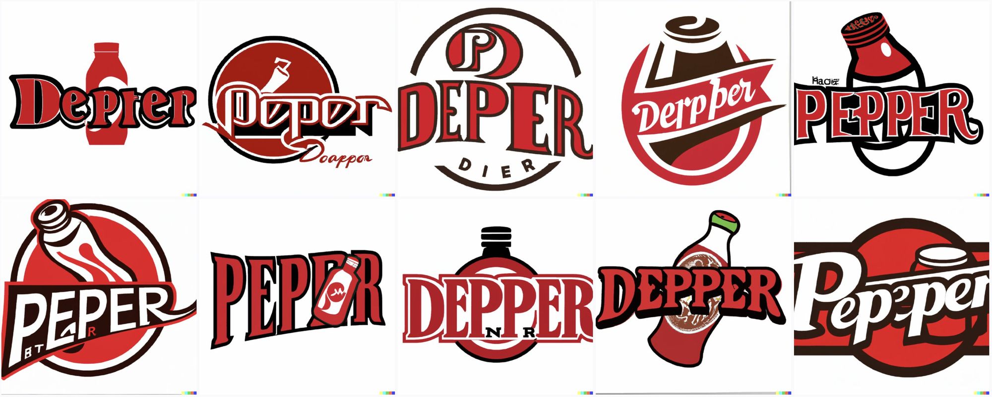
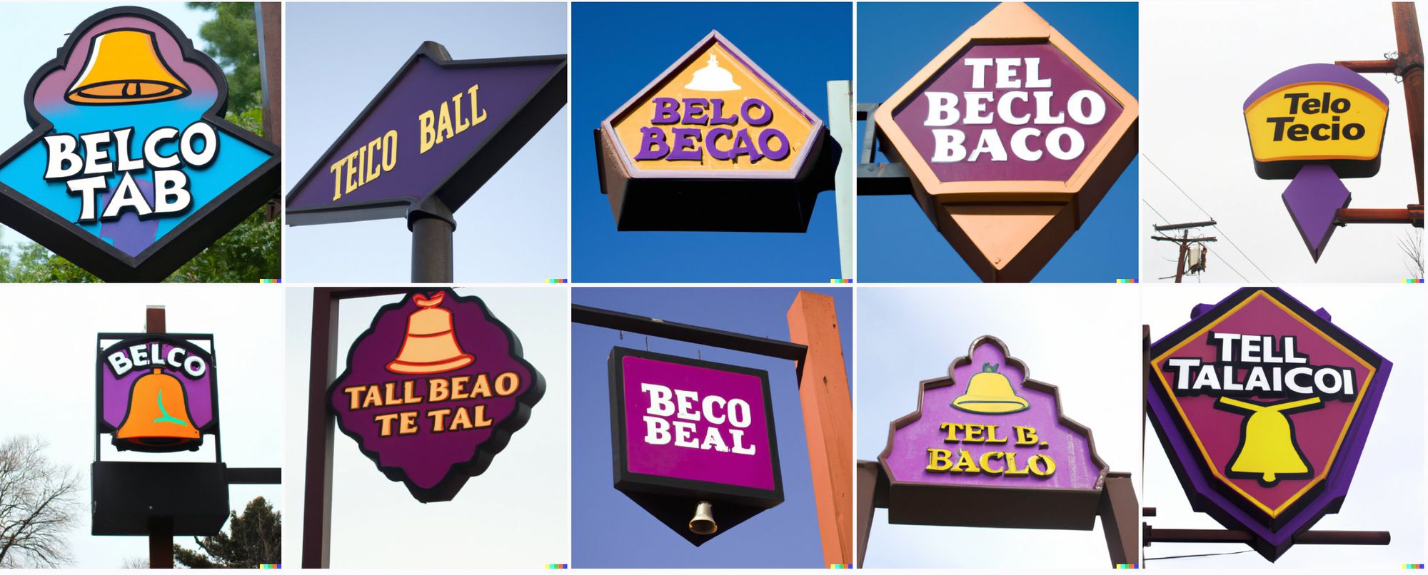
Even for a simple sign like "Arbys", it somehow manages to get the middle letters wrong 10 out of 10 tries.
![They are all signs with a brown cowby hat on top. The text reads variations on "Abby's", "Abry's", and "Aibiy's"](https://www.aiweirdness.com/content/images/2022/06/arbys.jpeg)
This one might be my favorite.
![Logos, each of which involves at least one donut image. They are variations on "Duntin Donuufts", "Oomo Dukims", "Doinko Donnts", "Dont Duns", and "Donkuh"](https://www.aiweirdness.com/content/images/2022/06/dunkin-donuts-1.jpeg)
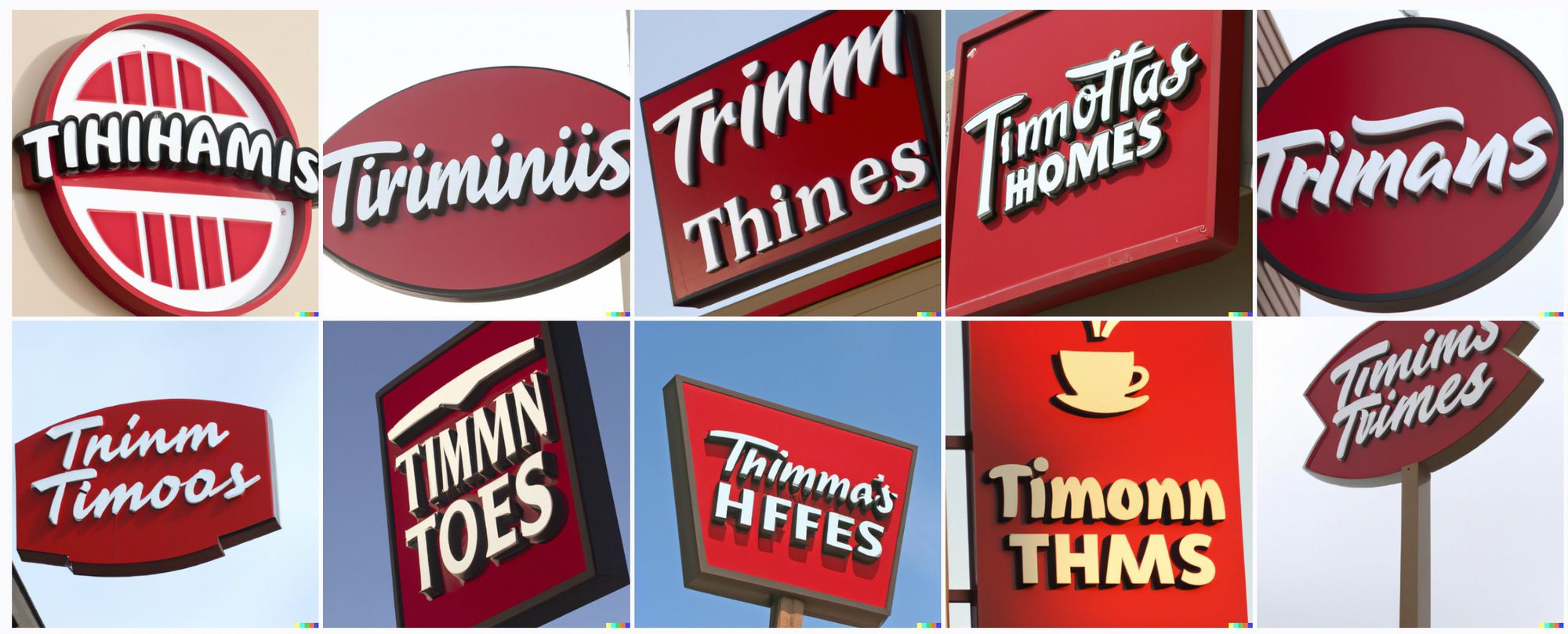
It has more trouble with longer text, such as its near-unrecognizable renditions of Tim Hortons.
![White script on red signs, of various shapes. One has a coffee cup. The words read something like "Tihihamis" and "Trinmm Thines" and "Thimma's HFFES" and "Tninm Timoos" and "Timmn Toes"](https://www.aiweirdness.com/content/images/2022/06/tim-hortons.jpeg)
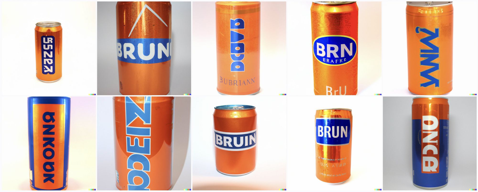
It also apparently has trouble with vertical text, like on the original cans of Irn Bru.
![Tall soda cans, orange with bright blue lettering. This is the color scheme of Irn Bru. But the letters all read "BRN" or "Brun" or "Bruin" or other completely illegible characters.](https://www.aiweirdness.com/content/images/2022/06/irn-bru-1.jpeg)
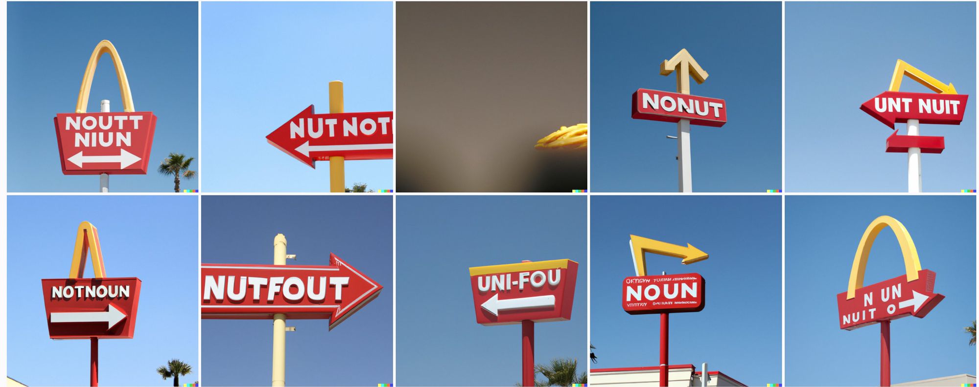
But note that In-N-Out, a California fast food brand, has palm trees and sunny skies in the background, whereas many of the Tim Hortons signs have grey skies. There's information being used on many levels, to get the shading right and the lettering consistent.
![Signs in red and white with arrows and arches. They read variations on "Noutt Niun" and "Nutfout" and "Uni-fou" and "Noun" and "Nonut"](https://www.aiweirdness.com/content/images/2022/06/in-n-out.jpeg)
Just not the spelling.
Bonus content: More brands, including an unexpected photorealistic goat-turtle.